Shopify Mobile Checkout: Removing Barriers for Shoppers on the Go
1. Introduction: Why Shopify Mobile Checkout Defines Your Conversion Rate
Over 72% of Shopify purchases now occur on mobile devices.
Yet, mobile abandonment rates remain painfully high, ranging from 67% to 82%. The biggest reason? Friction inside the Shopify mobile checkout flow.
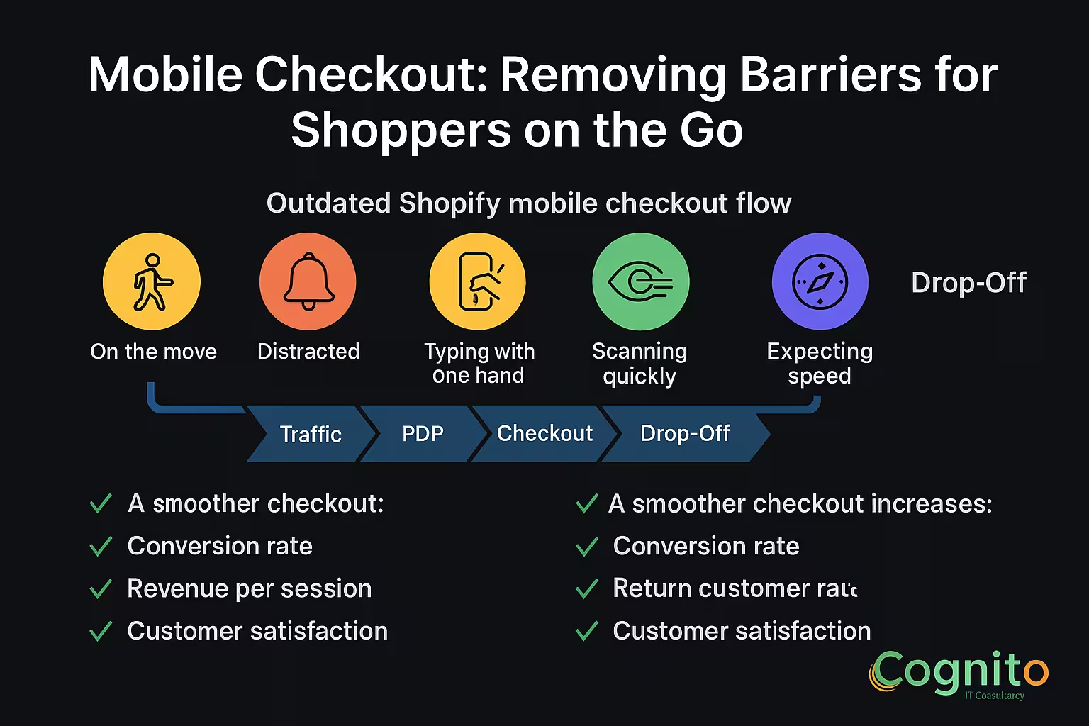
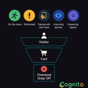
Your visitors are:
- On the move
- Distracted
- Typing with one hand
- Scanning quickly
- Expecting speed
This is why optimizing Shopify Mobile Checkout is one of the most powerful CRO levers for e-commerce brands.
A smoother checkout increases:
- Conversion rate
- Revenue per session
- Return customer rate
- Customer satisfaction
Shoppers don’t abandon because they don’t want the product.
They abandon because mobile checkout makes it too hard to buy.
2. What Makes Shopify Mobile Checkout Unique?
Shopify Mobile Checkout behaves differently from desktop because:
- Screen space is limited
- Load time impacts decisions instantly
- Typing fields feel longer
- Distractions are constant
- Scroll depth increases friction
- Form errors feel more frustrating
This makes even small friction points expensive.
Every extra tap = lost revenue.
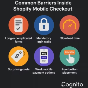
3. Common Barriers Inside Shopify Mobile Checkout
3.1 Long or complicated forms
Mobile users quit when forms feel endless.
3.2 Mandatory login walls
Account creation is the #1 friction point on mobile.
3.3 Slow load time
A 1-second delay = 7% loss in conversions.
3.4 Surprising costs
Hidden shipping fees kill trust instantly.
3.5 Weak mobile payment options
No Apple Pay or Shop Pay = more drop-offs.
3.6 Poor button placement
Buttons outside the thumb zone reduce taps.
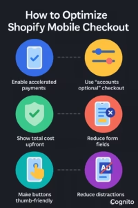
4. How to Optimize Shopify Mobile Checkout (Step-by-Step)
Below are the highest-impact actions to improve Shopify Mobile Checkout and reduce abandonment fast.
4.1 Enable Accelerated Mobile Payments
Shoppers prefer one-tap checkouts like:
- Shop Pay
- Apple Pay
- Google Pay
- PayPal Express
These reduce form filling by up to 70%.
4.2 Use “Accounts Optional” Checkout
Forced login kills conversions.
Settings → Checkout → Accounts are optional
This gives shoppers a choice without blocking the purchase.
4.3 Reduce Form Fields
Only ask for:
- Shipping
- Payment
Avoid:
❌ Secondary phone numbers
❌ Optional notes
❌ Marketing fields
❌ Additional contact fields
Shorter forms convert faster.
4.4 Show Total Cost Upfront
Transparency increases trust on mobile.
Display:
- Shipping
- Taxes
- Discounts
- Delivery estimates
No surprises = more completed checkouts.
4.5 Make the Checkout Buttons Thumb-Friendly
Place CTA buttons inside the primary thumb zone.
A 44px height minimum is recommended for mobile tap targets.
4.6 Reduce Distractions on Mobile Checkout
This means:
- No popups
- No banners
- No upsells
- No nav menus
- No floating elements
A clean checkout is a converting checkout.
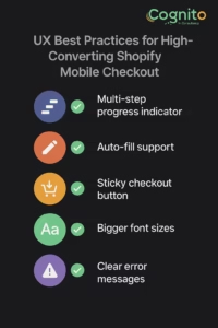
5. UX Best Practices for High-Converting Shopify Mobile Checkout
5.1 Multi-step progress indicator
Shoppers feel in control when they know where they are.
5.2 Auto-fill support
Let the browser fill email, address, and card details.
5.3 Sticky checkout button
Keeps the CTA visible during scrolling.
5.4 Bigger font sizes
Readable text reduces cognitive effort.
5.5 Clear error messages
Mobile users abandon when errors are confusing.
6. Shopify Mobile Checkout Enhancements Using Apps
If you want advanced options, these tools help:
- Rebuy (smart cart + upsells)
- Tapcart (mobile app builder)
- Shopify Extensions for Shop Pay
- Stay Ai (subscription-focused flows)
- Gokwik / Razorpay Magic Checkout (India)
These boost personalization and speed for mobile users.
7. Case Studies: Brands Winning with Shopify Mobile Checkout
Beauty Brand – +28% Conversion Lift
By enabling Shop Pay + Apple Pay.
Fashion D2C Brand – 34% Less Abandonment
After reducing form fields and auto-hiding the header.
Supplements Brand – 22% Faster Checkout Completion
With a sticky mobile CTA and upfront delivery date.
8. Conclusion: Mobile Checkout Is the New Cash Register
The brands winning in 2025 are the ones designing for mobile-first checkout.
Shoppers don’t have patience for friction.
When you optimize Shopify Mobile Checkout, you gain:
- Higher conversions
- Larger AOV
- Faster purchase decisions
- Happier customers
- Stronger lifetime value
On mobile, speed = revenue.
Clarity = trust.
One-tap checkout = conversions.
→ Get a Personalized Recommendation Audit from Cognito.
📩 Get your free audit here: https://cognitoitconsultancy.com/
📧 Book a Strategy Call: sandy@cognitoitconsultancy.com
👉 Meet Now: https://cal.com/cognitoitconsultancy/30min
🔗 Shopify Experts: Click Here
Follow Us for More Insights on D2C and Digital Transformation
Stay ahead of the curve in e-commerce, digital strategy, and IT consulting by connecting with us on our social platforms:


FAQ – Shopify Mobile Checkout
1. What is Shopify Mobile Checkout?
A streamlined version of Shopify’s checkout optimized for smartphone users.
2. Why do shoppers abandon mobile checkout?
Because of friction—long forms, slow loading, or forced login.
3. How can I reduce mobile checkout abandonment?
Enable fast payments, shorten forms, show costs early, and reduce distractions.
4. Do one-tap payments improve mobile checkout?
Yes—Shop Pay and Apple Pay improve conversions significantly.
5. Should mobile and desktop checkout be the same?
No—mobile checkout must be shorter, faster, and more scroll-friendly.
6. How do I test mobile checkout performance?
Use heatmaps, GA4 funnel tracking, and checkout A/B tests.