
Boost Sales with a Mobile Responsive Shopify Store
🏁 Introduction: Why Mobile Responsiveness Is the Unseen Backbone of D2C Success
In today’s D2C landscape, your mobile responsive Shopify store isn’t just a design asset — it’s your revenue engine.
Over 80% of eCommerce traffic now comes from mobile, yet most brands still treat mobile responsiveness as an afterthought.
A truly optimized mobile experience influences every stage of the customer journey — from acquisition and conversion to long-term retention.
At Cognito IT Consultancy, we help D2C brands build Shopify stores that load faster, convert smarter, and retain better — all through mobile-first performance strategies.
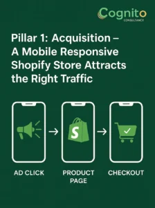
🧭 Pillar 1: Acquisition – A Mobile Responsive Shopify Store Attracts the Right Traffic
When customers first encounter your brand, 4 out of 5 times it happens on a mobile screen.
That means your acquisition funnel begins with how responsive your website feels.
A mobile responsive Shopify store improves not only design performance but also discoverability and ad ROI.
🔍 Here’s Why It Matters:
- Google’s mobile-first indexing: Non-responsive stores rank lower in organic search results.
- Ad conversion efficiency: Poorly optimized mobile landing pages waste ad spend.
- Social-driven traffic: 80% of clicks from Instagram, Threads, and TikTok are mobile-first.
When your store adapts fluidly across devices, your acquisition cost drops while engagement rises.
At Cognito, our Shopify audits evaluate:
- Media compression & lazy loading
- CSS optimization & Core Web Vitals
- Responsive grid and viewport testing
We ensure every paid click leads to a frictionless mobile journey.
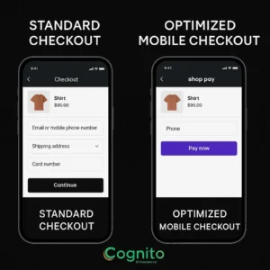
💰 Pillar 2: Conversion – Responsive Checkout Means More Completed Orders
Once customers land on your store, mobile responsiveness directly impacts conversion rates.
A mobile responsive Shopify store ensures every pixel and interaction is tailored for thumb-first navigation.
📈 The Data Is Clear:
- Every 1-second delay in mobile load time costs up to 7% in conversions.
- Mobile-optimized checkout flows convert 20–30% higher on average.
- Responsive CTA placements and field spacing reduce cart abandonment by up to 25%.
A great checkout experience is not just about visuals — it’s about speed, structure, and usability.
At Cognito IT Consultancy, we use:
- Shopify Checkout Extensibility to design adaptive checkout layouts
- A/B testing to validate button placement and color contrasts
- Shop Pay optimization for faster, low-friction payments
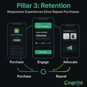
🔁 Pillar 3: Retention – Responsive Experiences Drive Repeat Purchases
Customer retention begins right after purchase — and mobile responsiveness plays a silent but critical role.
A mobile responsive Shopify store keeps customers coming back by making post-purchase interactions intuitive and enjoyable.
💡 The Key Retention Drivers:
- Mobile-friendly order tracking and account dashboards
- Loyalty tiers and rewards that display beautifully on any device
- Personalized recommendations and push notifications via Shopify + Klaviyo integration
Did you know?
👉 68% of users say they won’t return to a site that’s not mobile-friendly.
At Cognito IT Consultancy, we help brands integrate post-purchase flows and loyalty portals that work seamlessly across devices — increasing retention and lifetime value.
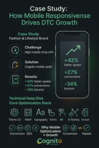
🧩 Case Study: How One D2C Brand Boosted Mobile Conversions by 27%
Industry: Fashion & Lifestyle
Challenge: High mobile traffic but poor conversions and checkout drop-offs
Solution: Cognito’s Shopify performance audit and mobile optimization strategy
Results:
- 42% faster mobile load time
- 27% increase in conversion rate
- 34% reduction in bounce rate
By optimizing responsive layout, checkout speed, and content delivery, we turned underperforming mobile sessions into profitable conversions.
⚙️ Technical Deep Dive: What Makes a Store Truly Mobile Responsive?
A mobile responsive Shopify store goes beyond flexible grids and media queries.
It’s about intelligent architecture that adapts dynamically to device behavior and user context.
🔧 Cognito’s Core Optimization Stack:
- Theme 2.0 structure & Liquid efficiency
- Image compression (WebP & AVIF)
- Responsive typography scaling
- Touch-friendly form controls
- AI-driven layout testing using Hotjar/GA4 insights
This ensures your site doesn’t just “fit the screen” — it feels native to every user interaction.
🧠 Why Mobile Optimization Equals Business Growth
A mobile responsive Shopify store is not just a design win — it’s a strategic lever for sustainable growth.
🚀 Benefits:
- Higher conversion rates
- Better SEO rankings
- Lower bounce rates
- Stronger customer loyalty
- Improved ad ROI
Every millisecond saved and every tap optimized compounds over time — building a competitive edge that lasts.
🧩 Cognito IT Consultancy: Your Mobile Optimization Partner
Whether you’re scaling a D2C brand or optimizing a Shopify Plus storefront, mobile responsiveness is the foundation of your growth strategy.
At Cognito IT Consultancy, we:
- Audit your store for performance & UX bottlenecks
- Rebuild mobile experiences that maximize conversions
- Integrate automation tools to retain customers seamlessly
⚡ Conclusion – The Future of D2C is Mobile-First
The future belongs to D2C brands that treat mobile not as a design afterthought, but as the core of their digital strategy.
Your mobile responsive Shopify store is more than a website — it’s your sales engine, your customer experience platform, and your growth multiplier.
📩 Ready to optimize your D2C store for mobile growth?
Let’s build a responsive, conversion-ready experience together.
🌐 Cognito IT Consultancy — Shopify experts in CRO, performance, and responsive design.
📧 Book a Strategy Call: sandy@cognitoitconsultancy.com
👉 Meet Now: https://cal.com/cognitoitconsultancy/30min
🔗 Shopify Experts: Click Here


