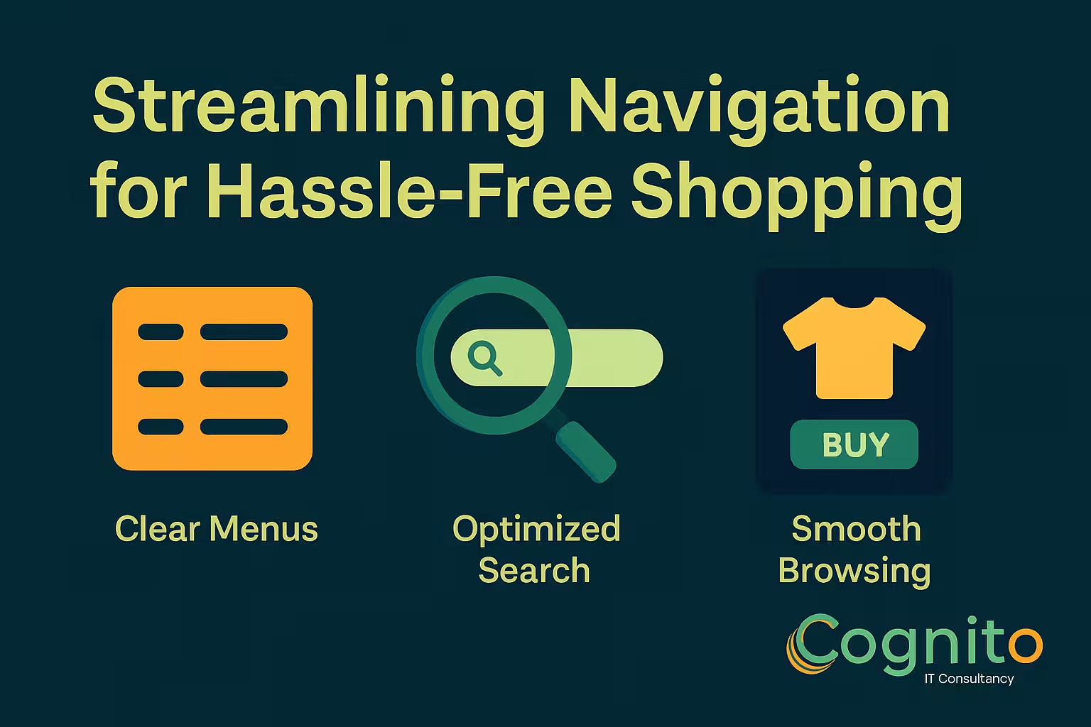
Streamlining Navigation for Hassle-Free Shopping
A smooth buying journey is one of the biggest competitive advantages in e-commerce today. That’s why Streamlining Navigation for Hassle-Free Shopping is no longer optional—it’s essential. When customers can find what they want instantly, they stay longer, browse more, and convert faster. Confusing menus, cluttered pages, and slow navigation, however, frustrate shoppers and send them to competitors within seconds.
In this guide, you’ll learn how to simplify navigation, boost usability, and create a shopping experience that feels effortless from start to finish.

Introduction: Why Streamlining Navigation for Hassle-Free Shopping Matters
Today’s customers expect fast paths, clear layouts, and instant access to the products they want. Streamlining Navigation for Hassle-Free Shopping ensures your users can browse confidently without friction. The easier the journey, the higher the conversion rate—and the stronger the brand loyalty.
Customers don’t stay when websites feel confusing. They stay when everything feels intuitive.
Understanding User-Friendly Navigation
What “Hassle-Free Shopping” Really Means
Hassle-free shopping means minimal effort, predictable design, and zero confusion. Visitors don’t need to guess where to click—they instinctively know.
How Site Navigation Impacts Conversions
Navigation is the backbone of UX. When shoppers don’t find what they’re looking for within a few clicks, they abandon. Smooth navigation leads directly to more purchases and repeat customers.
Key Principles of Streamlining Navigation for Hassle-Free Shopping
Clarity and Minimalism
Simple menus perform better than complex ones. Offer fewer choices but clearer paths.
Predictable Menu Structures
People prefer familiar patterns. Stick with well-known menu layouts and standard naming conventions.
Clean Category Architecture
Group items logically to reduce cognitive load. The clearer the categories, the faster shoppers move.

Mobile Navigation Optimization
Thumb-Friendly Layouts
Place key tabs, navigation buttons, and filters within natural thumb reach zones.
Sticky Menus & Quick-Access Tabs
A fixed bottom bar lets users move around instantly—no scrolling required.
Search Bar Optimization for Hassle-Free Experiences
Predictive Search Suggestions
Show results as the shopper types. This dramatically speeds up navigation.
Auto-Correct & Auto-Complete Features
Prevent dead-end searches by fixing typos and offering relevant suggestions automatically.
Smart Filters & Sorting Options
Attribute-Based Filtering
Allow customers to filter by size, color, features, price, and more.
Dynamic Sorting for Quick Decisions
Options like “Most Popular,” “Newest,” and “Best Value” help guide shoppers toward desired items quickly.

Using Visual Cues to Support Streamlining Navigation
Icons, Labels & Breadcrumbs
Icons improve recognition. Breadcrumbs give users awareness of their path.
Consistent UI Patterns
Using the same design patterns reduces confusion and builds familiarity.
Homepage Navigation Enhancements
Personalized Recommendations
Show shoppers items based on their behavior, demographics, and interests.
Hero Sections & Core Categories
Your homepage should act as the gateway to everything important.
Product Page Navigation Improvements
Clear CTA Placement
Your “Add to Cart” button must be unmissable.
Related Items & Complementary Links
Offer accessories or similar products to reduce drop-offs and increase average order value.

Checkout Navigation Flow
One-Page Checkout
This reduces hesitation and speeds up the payment process.
Progress Indicators & Trust Cues
Customers feel more confident when they know how many steps are left.
Common Mistakes That Ruin Hassle-Free Shopping
Overloaded Menus
Too many categories overwhelm shoppers.
Hidden CTAs
If users can’t find the button, they won’t complete the action.
Tools to Help With Streamlining Navigation for Hassle-Free Shopping
Heatmaps & Behavior Analytics
Tools like Hotjar or Clarity help you understand where users struggle.
UX Testing Tools
A/B testing and session replays help refine navigation over time.
Case Studies: Brands That Master Streamlined Navigation
E-commerce Example
Brands like Apple and Amazon excel by using ultra-clear paths and minimal friction.
Service-Based Brand Example
Airbnb’s clean layout and intuitive filters help users find stays instantly.
FAQs
- What does streamlining navigation mean?
Making it easier for users to browse, search, and shop. - Why does navigation affect sales?
Confusion causes drop-offs—clarity drives conversions. - Does mobile navigation matter more?
Yes. Most shoppers use mobile devices. - How can filters improve shopping?
They reduce time spent searching by narrowing results instantly. - What tools help improve navigation?
Heatmaps, A/B testing, and user behavior analytics. - Is minimal design better?
Absolutely. Simplicity improves usability.
Conclusion
Streamlining Navigation for Hassle-Free Shopping creates a customer journey that feels smooth, intuitive, and enjoyable. When shoppers can find what they need quickly, trust grows—and conversions follow. By simplifying menus, optimizing search, improving product pathways, and designing with clarity, any brand can dramatically elevate the shopping experience.
→ Get a Personalized Recommendation from Cognito.
📩 Get your free audit here: https://cognitoitconsultancy.com/
📧 Book a Strategy Call: sandy@cognitoitconsultancy.com
👉 Meet Now: https://cal.com/cognitoitconsultancy/30min
🔗 Shopify Experts: Click Here
Follow Us for More Insights on D2C and Digital Transformation
Stay ahead of the curve in e-commerce, digital strategy, and IT consulting by connecting with us on our social platforms:


