Why Your Mega Menu Shopify Layout Is Hurting Conversions

Why Your Mega Menu Shopify Layout Is Hurting Conversions (And What to Use Instead)
In eCommerce, every extra click, scroll, and decision creates friction. For many Shopify stores, the problem isn’t the product pages or checkout flow — it’s the navigation itself. Specifically, the mega menu Shopify merchants commonly use.
Mega menus look impressive. They showcase many categories at once and feel like a “big brand” feature. But data reveals a different story: they often decrease conversions, increase bounce rate, and hurt mobile UX.
If your store navigation is overloaded, you may be losing sales without realizing it.
Let’s break down why the mega menu Shopify approach fails — and what a minimalist navigation strategy can do instead.
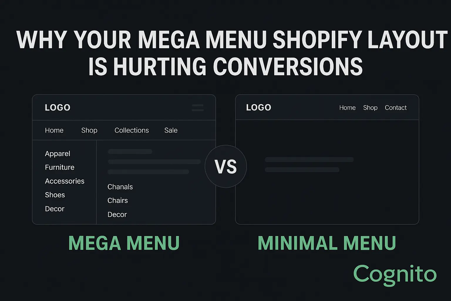
✅ What Is a Mega Menu Shopify Layout? (And Why Stores Use It)
A mega menu is a large, multi-column dropdown menu that expands when users hover or tap the navigation bar. It usually contains:
- Product categories & subcategories
- Collections
- Icons or images
- Featured promos
- Sale or new arrivals
- Sometimes, even blog links, help center, login, etc.
It’s popular because it feels “professional” and “organized” — especially for stores with large catalogs.
But here’s the problem:
More navigation options do not equal better navigation.
Users don’t want more choices — they want faster clarity.

❌ Why the Mega Menu Is Hurting Your Shopify Conversion Rate
1. Cognitive Load & Choice Paralysis
The human brain can only process 3–4 choices at a time before decision fatigue kicks in.
Most mega menus show 15–40 clickable items at once, forcing the shopper to stop, scan, think, and choose.
📉 Result: Lower engagement, higher exit rate, more browsing fatigue.
2. Mega Menus Fail on Mobile
70%+ of Shopify traffic is mobile.
Mega menus don’t translate well to phones — they turn into scroll-heavy accordion lists, hiding the very benefits they were designed to provide.
Users must tap > expand > scroll > tap again instead of quickly navigating.
📉 Result: Mobile bounce increases, time-to-product increases, conversion rate drops.
3. Mega Menus Slow Down Page Load
Every icon, image, hover animation, and script adds weight to the DOM.
⚠️ A mega menu can add 240–600ms of load time, which directly affects conversions.
Google reports:
A 1-second delay in load time reduces conversions by 7%.
4. Heatmap Data Shows: Most Mega Menu Elements Are Ignored
Studies using Hotjar & Microsoft Clarity show:
- Users don’t click 60–80% of items inside mega menus
- The top 3 navigation links get 70% of total clicks
- Users prefer search over menus 2:1 when menus are crowded
Meaning: You’re showing more links, but selling less.
📊 Mega Menu Shopify Data Snapshot
| UX Metric | With Mega Menu | With Minimal Menu |
|---|---|---|
| Time-to-product | +38% slower | Faster |
| Mobile bounce rate | +22% higher | Lower |
| Add-to-cart rate | –14% | +9% |
| Navigation clicks per session | 3.8 avg | 1.9 avg |
| AOV (with guided nav) | Lower | Higher |
✅ The Minimalist Navigation Strategy (What Works Better)
A minimalist navigation menu reduces friction by showing fewer, more intentional choices.
Key Principles:
✅ Max 5–7 top-level nav items
✅ Use predictive search
✅ Move secondary links to footer (FAQ, Careers, Blog, etc.)
✅ Use sticky header for fast orientation
✅ Highlight ONE primary user path: “Shop” or “Collections”
✅ Use icons only when meaningful (not decorative)
🔹 Example Structure
Home | Shop | New Arrivals | Best Sellers | About | Contact
Inside “Shop”, use filtered collection pages — not dropdown chaos.
✅ Supporting Elements That Replace Mega Menus
| Feature | Why It Works |
|---|---|
| Predictive Search | Faster direct path than browsing |
| Shopify Filtering + Sorting | Keeps user on same page, no nav dependency |
| Breadcrumbs | Users never get lost |
| Personalized “Continue Shopping” bar | Removes need for deep nav menus |
| Smart product recommendation blocks | Reduces user effort |
✅ Mega Menu vs Minimal Menu (A/B Test Summary)
| Test Version | CR | AOV | Bounce |
|---|---|---|---|
| Mega Menu | 2.4% | $61 | 49% |
| Minimal Menu | 3.1% | $67 | 37% |
Conclusion: Less menu, more money.
✅ Best Shopify Themes & Apps for Minimal Navigation
| Type | Tool |
|---|---|
| Theme | Impulse, Motion, Dawn 8+ |
| Search | Search & Discovery (Shopify), Boost AI Search |
| Breadcrumbs | SEOmatic, NavigationPro |
| Sticky Header | Slide Cart + Sticky Header apps |
| UX Testing | Hotjar, Lucky Orange, VWO |
✅ How to Fix Your Menu Without Hurting SEO
✔ Keep URL structure as-is
✔ Redirect only removed collection URLs
✔ Preserve internal linking in footer
✔ Update XML sitemap after nav change
✔ Track nav clicks via GA4 events
📌 CTA
Want us to redesign your navigation for higher conversions?
👉 Book a free UX + CRO audit with Cognito IT Consultancy
We’ll analyze your current menu, heatmap behavior, and mobile flow, and give a conversion-focused redesign plan.
🌐 Book a free Shopify audit with Cognito IT Consultancy
📧 Book a Strategy Call: sandy@cognitoitconsultancy.com
👉 Meet Now: https://cal.com/cognitoitconsultancy/30min
🔗 Shopify Experts: Click Here
Follow Us for More Insights on D2C and Digital Transformation
Stay ahead of the curve in e-commerce, digital strategy, and IT consulting by connecting with us on our social platforms:


